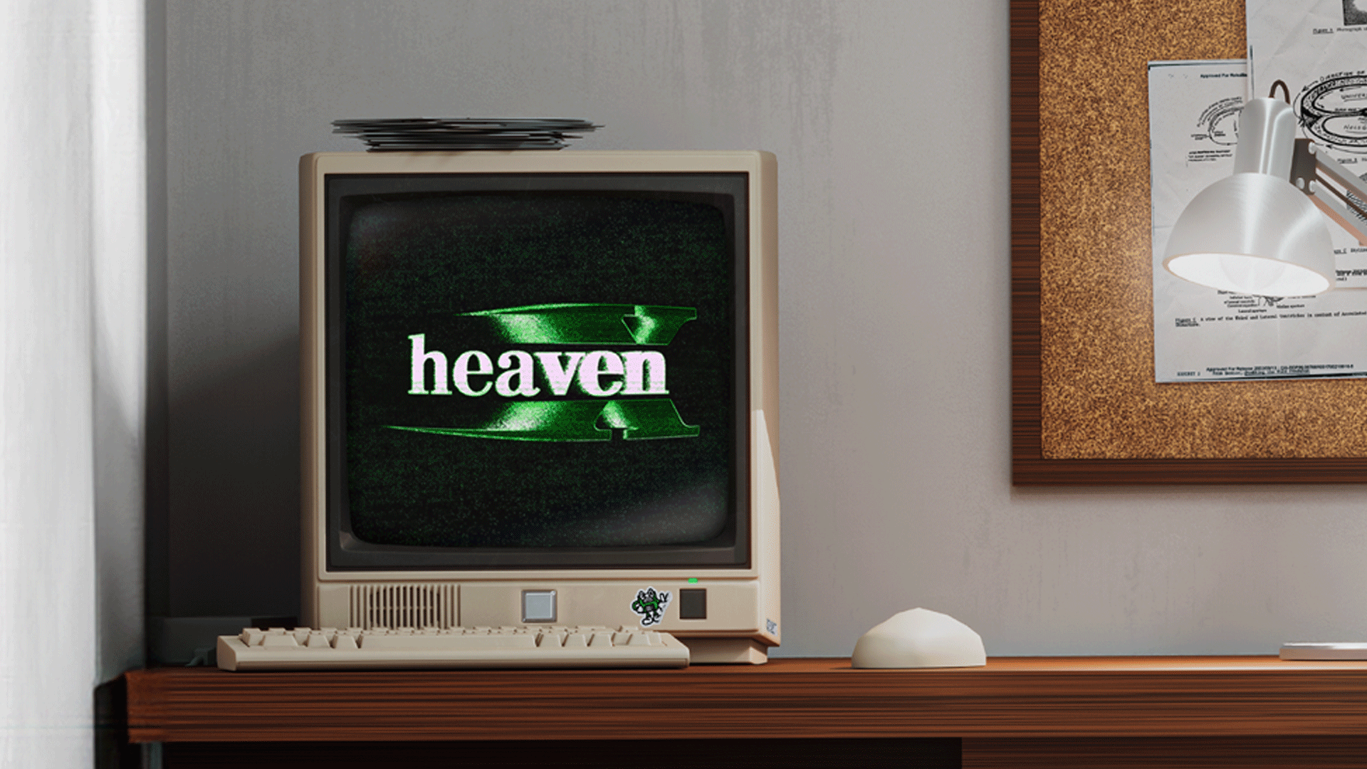
HeavenX
HeavenX Devlog 0008
In-Universe Software
Designing in-universe software for HeavenX has three core requirements: it needs to look like actual office software, it needs to look cool, and it still has to function as a usable video game UI. Hitting two of those criteria at a time is fairly easy. Hitting all three at once can pose some interesting creative challenges.
In this image, you are the baby!
Balancing Realism and Playability
When making simulated workplace productivity tools, if it looks too real it risks becoming unreadable or unfun. Real enterprise software is often actively hostile to the eye. Layouts are built for tasks more complex than the interactions in our game, and function is typically prioritized over aesthetics. If we mimic that too closely, we just replicate the friction in an environment that is supposed to be a game. On the other hand, if it looks too cool it breaks the fiction. This tension shows up everywhere -- especially when trying to make something intentionally bad without making it unusable.
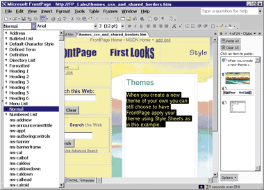
Our UI inspiration comes from real world software! We used Microsoft Frontpage 2002 to make our company website: https://zhi.cn.com/
The Challenge of Imperfection
Real enterprise software is easy to mimic. What’s harder is resisting the urge to fix it. You can spend hours crafting the perfect layout, only to realize you accidentally made something a little too interesting. The trick is finding the exact line where realism still permits comprehension, and then stopping there. Once something starts to look good, it’s hard to stop. Clean spacing, tighter typography, more consistent color. All of these things improve legibility, but it also pushes the game visually out of its intended time period.
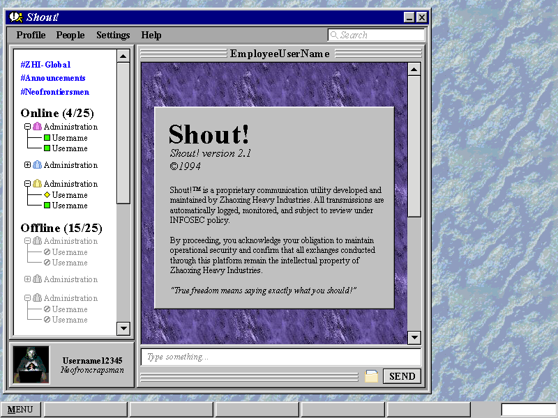
An in progress view of "Shout!", the in-universe equivalent to Slack or Teams.
We’ve settled on a working method that prioritizes authenticity at a glance, then usability in interaction. Modern UX, ancient UI. Subtract polish on purpose. Add back some blue-gray gradients. Fuck up the padding. Push toward bad decisions that feel accurate. Many interface elements are styled like legacy software (bevels, chunky layouts, toolbars) but behave more predictably once the player engages. Cursor states are exaggerated. Hover effects are tuned to feel chunky but not laggy. Drag and drop exists. It’s fake old software with certain modern affordances hidden underneath.
In the case of HeavenX the job isn't just about making it look good -- its about making it look bad in the right way.
XOXO
- Art Team
(its just one person its literally just me)
Leave a comment
Log in with itch.io to leave a comment.